The Cover Test: Winning Book Design Strategies
How do designers create children's book covers that stand out against the competition? Here’s insight into the process behind some recent titles.
 We’ve all heard the old adage “Never judge a book by its cover.” But as school and public librarians, you may well judge books by their covers all the time, whether you are conscious of it or not. It’s hard to look away from a great cover, especially with picture books. And publishers know that a gut reaction to a picture book cover can mean the difference between a librarian adding that title to a collection or looking for other options.
“We have fewer than three seconds of consumer attention when they are scanning shelves and tables,” says Manda Scott, head of picture book design at the publisher Nosy Crow. “So whatever cover image we go for, we have to grab the attention of our paying customer enough in three seconds that they will pick it up to read the back copy.”
Three seconds isn’t long, considering how many hours publishers spend developing a picture book cover and design. So how do designers rise to meet this challenge and strategically construct covers that stand out against the competition? Here’s some insight into the process behind recent notable titles.
...
 |
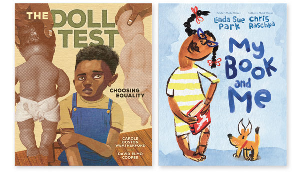
From left: The Doll Test by Carole Boston Weatherford, illustrated by David Elmo Cooper;My Book and Me by Linda Sue Park, illustrated by Chris Raschka |
Picture book cover design usually starts after the interiors are nearly finished for a simple reason: working with finished interiors ensures that designers have the deepest possible understanding of a story before devising a way to seamlessly synopsize its genre, tone, typography, value add, and intended reader age on the cover. And since a cover can be the best possible advertisement for the book, it needs to accurately reflect the story.
Many tales and topics lend themselves to certain cover design or composition formats, so summarizing a story using visual motifs is often a matter of following an unspoken set of rules. One common blueprint portrays a main character or symbol centered in the forefront and surrounded by a set of eye-catching elements—including the title font—that hint at the narrative.
You need only look at the covers of some of the most prestigious illustration award winners from the past decade to see how successful this method is.
Given this tried-and-true strategy, designers often stay with what’s working. To consider a recent example, look at the unusual cover of The Doll Test by Carole Boston Weatherford, illustrated by David Elmo Cooper (Lerner/Carolrhoda, 2024). Narrated in verse by dolls, this powerful book explores the psychological effects of segregation on children, pioneered by Black psychologists Kenneth and Mamie Clark in the 1950s. The claustrophobic, unsettling cover expertly hints at the discomfort experienced by the children as they are shown both Black and white baby dolls and asked to choose one that looks like them.
[Also read: "What Makes a Good Picture Book Great? The Difference Is in the Details."]
“David Cooper brings a unique visual perspective to this art,” says Danielle Carnito, senior art director at Lerner. “We wanted a feel of ‘closing in’ overall on the front cover, so figures encroaching on the title placement on the cover is very intentional here between art and design.”
It’s hard not to feel like things are closing in. A faceless set of hands offering dolls is coming from the upper corners, and the perspective has readers looking down on a child who appears to be shrinking away. This unease is a thread readers can expect to see carried throughout the book.
It isn’t only the cover’s central image or character that has to do the heavy lifting, Carnito notes. The title font must also contribute in a way that is meaningful and cohesive. And the font is rarely the same as what’s inside. Not only does it have to be large and legible while making space for the main character (and sometimes a subtitle), but it also must gel with the illustration style.
 |
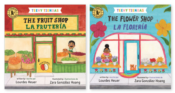
“Teeny Tiendas” series titles The Fruit Shop/La frutería andThe Flower Shop/La florería by Lourdes Heuer, illustrated by Zara González Hoang |
Few cover titles look more organic—and are as time- and cost-saving—than ones hand-lettered by the illustrator themselves. “When an artist is keen to do some hand-lettering, I almost always lean into that,” says Lauren Rille, art director at Simon & Schuster children’s division. “I love how unique and unexpected it can be.”
Take, for instance, My Book and Me by Linda Sue Park and illustrated by Chris Raschka (Red Comet, 2024). The main character and title font take up similar space. The story is a tribute to the comfort of reading, and the joyful child’s jaunty pose next to the title hints that words are key players in this sweet story. “Chris Raschka painted the type, and we composited with backgrounds that he painted for use throughout the book,” explains Michael Yuen-Killick, Red Comet creative and editorial director. “No bells and whistles, just Chris’s beautiful work.”
Covers for a book series require something different—capturing the overarching theme of the series as well as each title in it. Designers must create something that will work for individual books—even ones that haven’t been acquired yet—and balance that with the series themes. The bilingual board book series “Teeny Tiendas” by Lourdes Heuer, illustrated by Zara González Hoang (Candlewick, 2024) walks this line beautifully.
The series concept is a bilingual introduction to various shops kids might find in their communities. “Each book in the series is designed to be a little storefront, and each shop has its own distinct look,” says Candlewick senior designer Hayley Parker. “But the colorful series banner and spine design tie them together. Not to mention that the sidewalks in front of the stores align, so you really can line the books up.”
The Fruit Shop/La frutería and The Flower Shop/La florería each has a distinct appearance, while they’re linked together through typography, the book title styled like a store name, the series banner—and those sidewalks.
 |
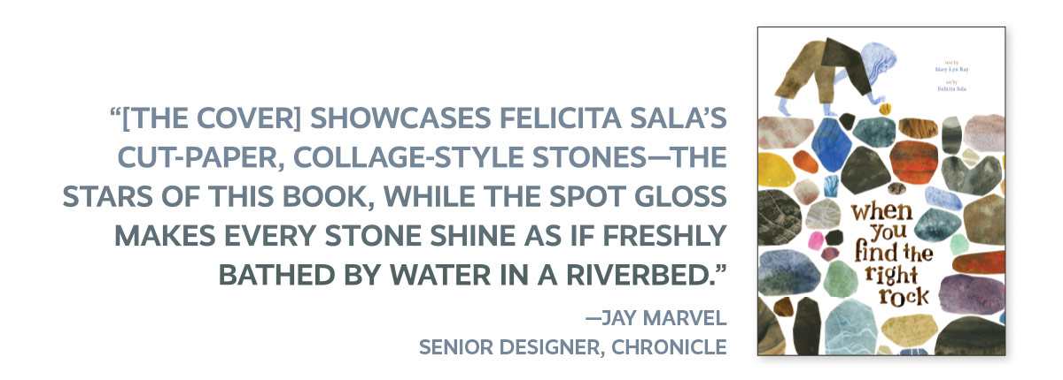
When You Find the Right Rock by Mary Lyn Ray, illustrated by Felicita Sala |
Bells and whistles
Nailing down those key elements is the largest chunk of the design puzzle. But other details that can intrigue buyers involve extra printer treatments, such as raised or depressed textures (known as embossing or debossing); spot glosses that create a smooth, shiny look; a texture treatment known as foiling, which shimmers; and special inks.
These can help covers stand out on a shelf—remember, three seconds—and add an attention-grabbing tactile layer. However, such elements shouldn’t overpower or dilute a story’s message. Opting not to include a special feature can be equally intentional, says Jennifer Tolo Pierce, design director at Chronicle Books. While additions “can bring an additional layer of storytelling and presence to a cover,” Pierce says, “we only utilize techniques that will elevate the reader’s experience and discoverability of a book.”
Given the choice, though, most picture book designers say they try to add at least one extra printer treatment. When there’s a thematic way to tie it in, all the better. When You Find the Right Rock by Mary Lyn Ray and illustrated by Felicita Sala (Chronicle, 2024) is a shining example, with a spot gloss treatment that hints at the watery motif throughout the story.
The image “showcases Felicita Sala’s cut-paper, collage-style stones—the stars of this book,” says Chronicle senior designer Jay Marvel, “while the spot gloss makes every stone shine as if freshly bathed by water in a riverbed.”
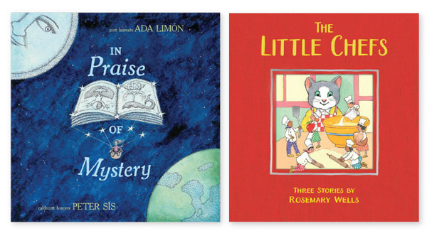
Another skillful example is The Little Chefs by Rosemary Wells (Astra/Hippo Park, 2024), which uses foil on the cover to draw readers in and provide a shiny visual thread to follow through the book. “The silver foil on the covergives it a bit of magic and works on two levels,” says Melia Parsloe, art director at Astra/Hippo Park. It catches the viewer’s eye and introduces the silver effect used inside whenever the chefs appear.
Printing with a special extra color can also enrich a cover. Most book covers are printed in four colors—cyan, magenta, yellow, and black—with different combinations yielding the various hues we see printed on the finished art. But designers will sometimes add a fifth one to make an image pop. In Praise of Mystery by U.S. poet laureate Ada Limón and illustrator Peter Sís (Norton, 2024), which takes readers to space aboard NASA’s Europa Clipper, is a perfect example. While fifth colors come in all shades (neon is popular), the team behind this book used a metallic ink to signal the interstellar journey that readers are about to join as they read Limón’s poem of exploration and wonder. Unlike foil, which adds texture, metallic ink is printed directly onto the cover.
 |
From left: In Praise of Mystery by Ada Limón, illustrated by Peter Sís;The Little Chefs by Rosemary Wells |
Future trends
So what will the future hold? Some publishers predict a gradual shift toward eco-friendly printing techniques and developing designs that are legible at thumbnail size for online customers. The impact of AI is also top of mind for many publishers. The possibilities that AI is creating are impossible to ignore. But many publishers, including Nosy Crow’s Manda Scott, believe that readers will still want something that looks like it was rendered by a human. The reason is simple: picture books are meant to be reassuring. “I think it’s likely we’ll continue to see a push toward traditional artwork styles and comforting familiarity,” Scott says. “My prediction is that consumers will put value on being able to tell that something has been ‘handmade.’ ”
Scott goes on. “Cover trends in children’s books, like in any other genre, are influenced by a complex interplay of cultural, technological, and market factors. Changes in popular culture, advancements in printing and design technology, and shifts in consumer preferences all contribute to the evolution.”
Mel Schuit (she/her) talks about children’s book design and illustration at Let’s Talk Picture Books. Find her online @spiky_penelope.
RELATED
The job outlook in 2030: Librarians will be in demand
The job outlook in 2030: Librarians will be in demand
ALREADY A SUBSCRIBER? LOG IN
We are currently offering this content for free. Sign up now to activate your personal profile, where you can save articles for future viewing


Add Comment :-
Be the first reader to comment.
Comment Policy:
Comment should not be empty !!!