Steve Jenkins on Popular Pick "Animals by the Numbers"

Photo courtesy of HMH
See SLJ‘s review of Animals by Numbers
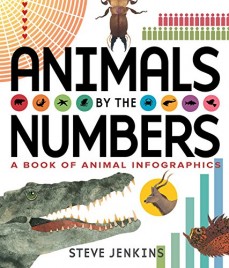
Steven Jenkins's Animals by the Numbers: A Book of Animal Infographics (HMH, Nov. 1, 2016), an October Popular Pick, is a perfect marriage of astounding animal facts and skillful use of infographics. SLJ spoke with Jenkins to discuss what inspired him to tackle this project.
Writing and illustrating an entire book dedicated to infographics must have been quite a challenge. What inspired you to take on such a task? I’d become interested in infographics for children while watching my own kids and their friends play complex computer games with multiple levels of graphic information—maps, 3-D diagrams showing threats and other players, bar graphs indicating time or energy levels, and so on. It occurred to me that children are way ahead of what we nonfiction authors are giving them in terms of how much visual information they can process. I also realized that the ability to read and understand the language of information graphics is an increasingly important component of literacy.
So I decided to make a book that was entirely composed of infographics, incorporating as many different ways of expressing quantitative information graphically as I could. Animals seemed like the obvious topic.
 What’s really amazing about this work is just how long readers can sit with each spread. When you laid out the text and images, was there anything you were particularly set on achieving? I looked at a lot of information graphics while researching the book. I found that in many cases the data—the point of the graphic—was difficult (in some cases impossible) to ferret out. It was as if the designers had become seduced by the cool way a tangle of lines or overlapping shapes looked, and had forgotten that their primary responsibility to readers was to make the information interesting and accessible. Given the age of my audience, I felt like my most important task was to make the graphics clear and readable. That often meant that I had to limit the number of things I could include in one infographic, and think about how the design could facilitate that accessibility.
What is the most fascinating thing you learned from your research? To me, the fact that the world’s insects probably outweigh the world’s humans by a factor of 300 to one is the single most startling piece of information in the book.
RELATED
The job outlook in 2030: Librarians will be in demand
The job outlook in 2030: Librarians will be in demand
ALREADY A SUBSCRIBER? LOG IN
We are currently offering this content for free. Sign up now to activate your personal profile, where you can save articles for future viewing


Add Comment :-
Be the first reader to comment.
Comment Policy:
Comment should not be empty !!!